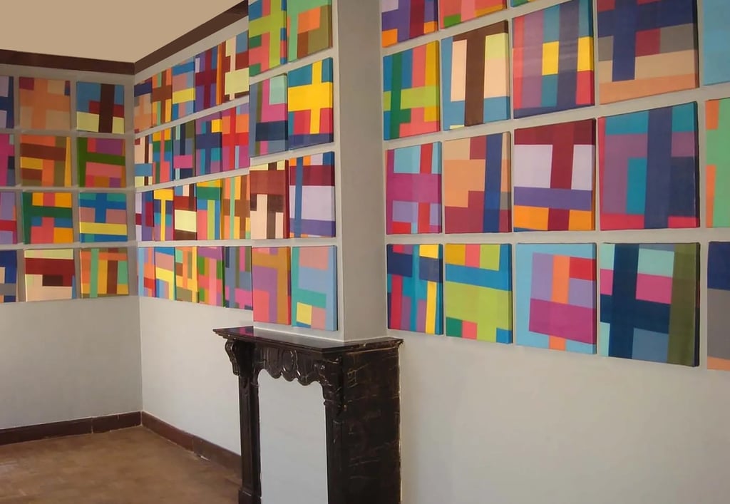
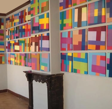
In order to establish a personal and confidential contact I prefer to write these GALLERY pages in the first person. Even though a number of paintings in the gallery are not for sale or have been sold in the past, they are added to this virtual showroom because they represent a significant part of my oeuvre. Where applicable, I will tell the story behind a painting or supply interesting background information.
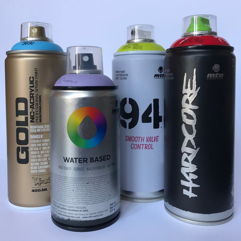
Before entering the gallery, I would like to point out that I always use high quality Montana Cans and Montana Colors (mtn) spray cans and that all the paintings are mounted on 4,5cm stretcher bars.
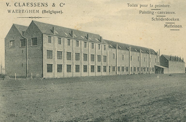
The excellent canvas I use is made by Claessens Canvas in Belgium, a company founded in 1906 supplying artists all over the world and situated merely 15 kilometers from where I live. They have a great website with amazing video’s of the production process through the ages.
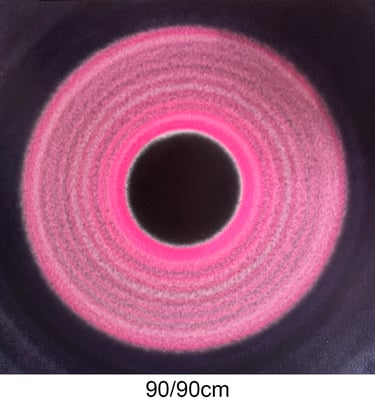
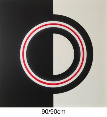
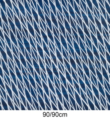
90/90cm
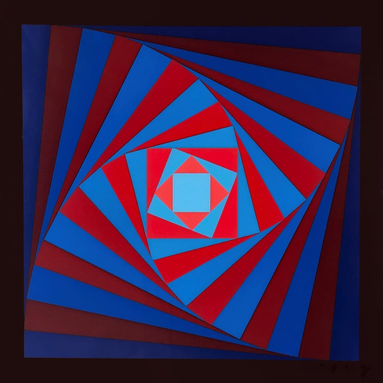
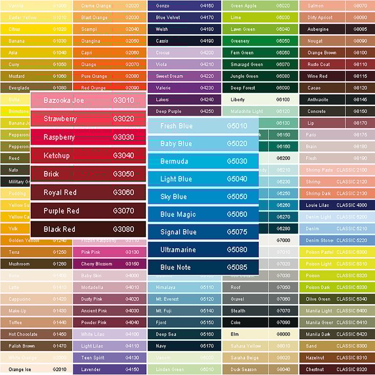
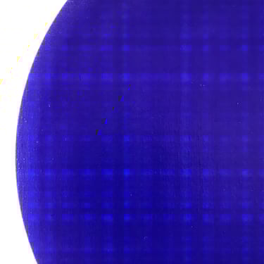
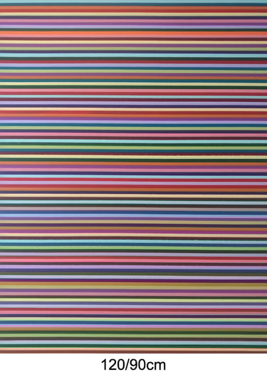
Talking about colors... obviously, when painting with spray cans it is impossible to mix colors and varieties are limited. The Montana Gold series provide one of the larger ranges and consist of a more than 200 color shades, including a range of standard, transparent, and special effect colors..
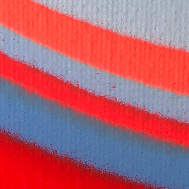
For this particular painting I used the available red and blue shades as shown in the enlargements of the color chart below.
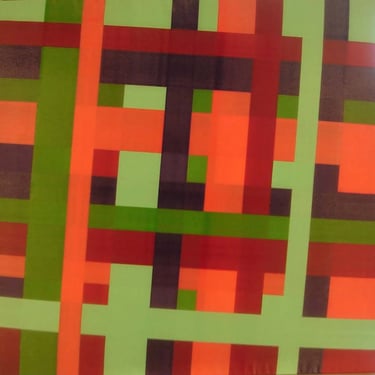
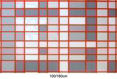
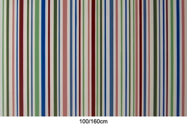
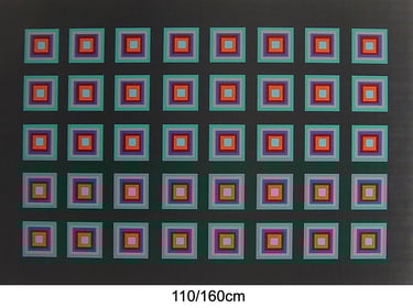
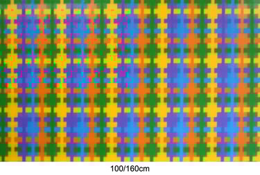
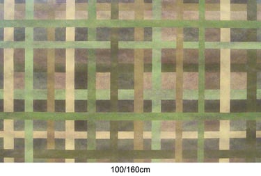
100/160cm
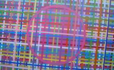
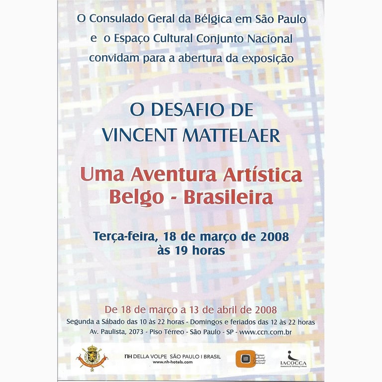
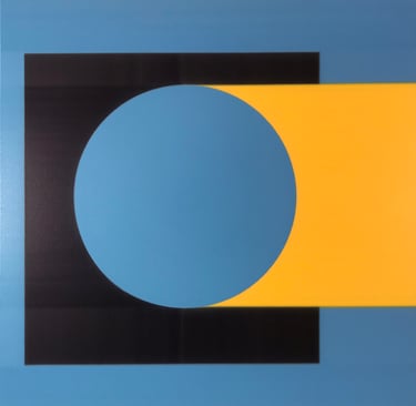
Perhaps my favourite earlier work. Made in 2007, I used the image for the design of an invitation to an exhibition in 2008. The painting (amongst others) travelled all the way to Brasil and back to Belgium before it was sold in 2015 to a customer who told me the painting made her feel cheerfull.
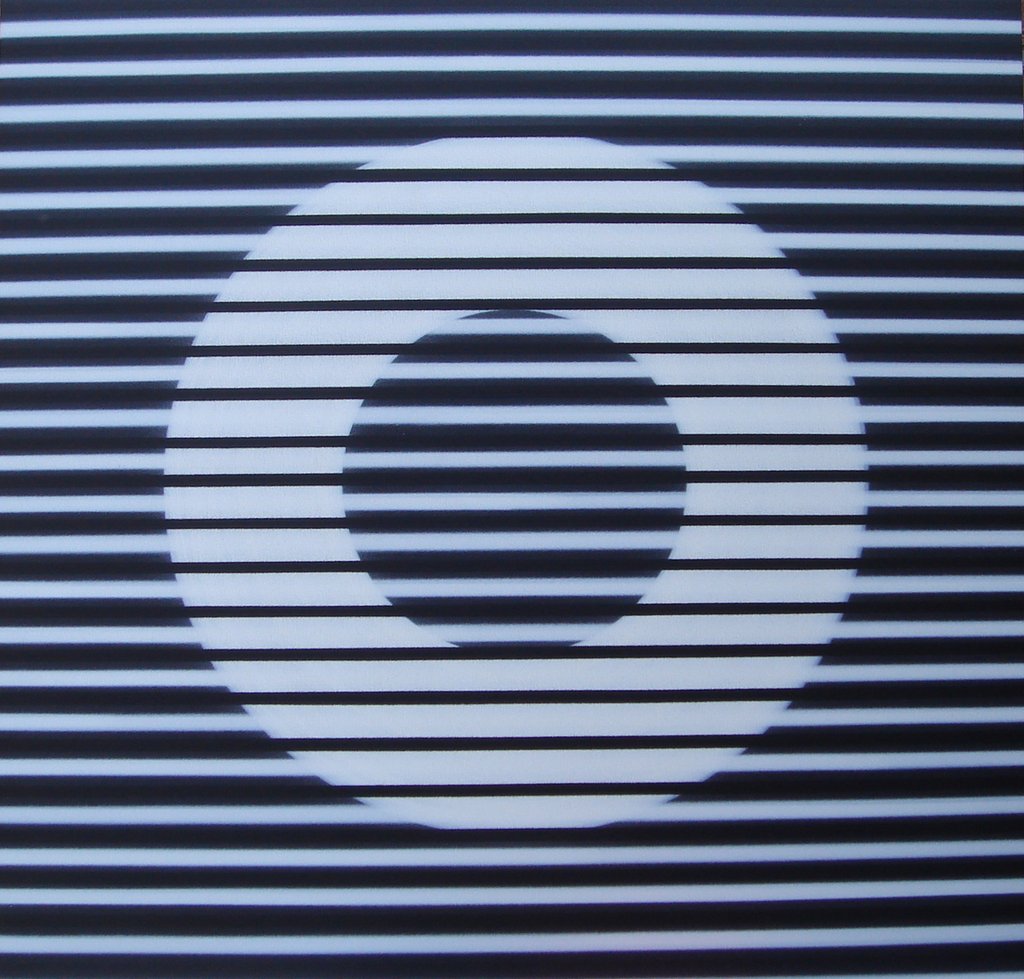
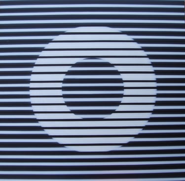
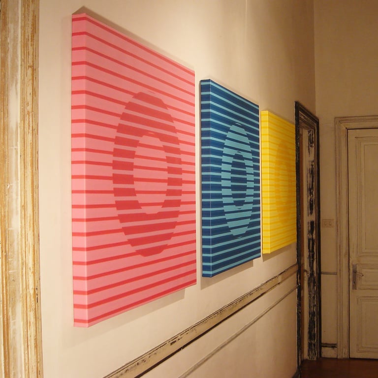
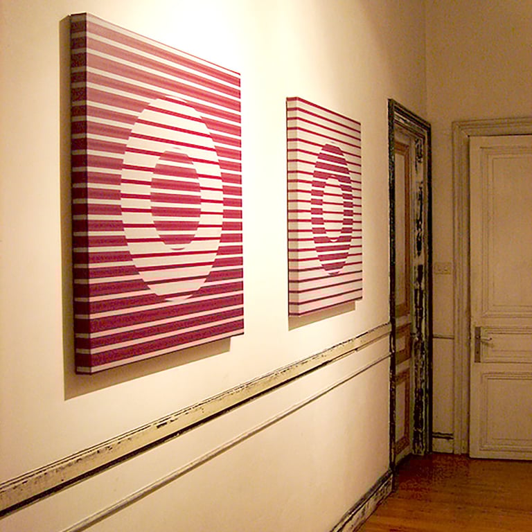
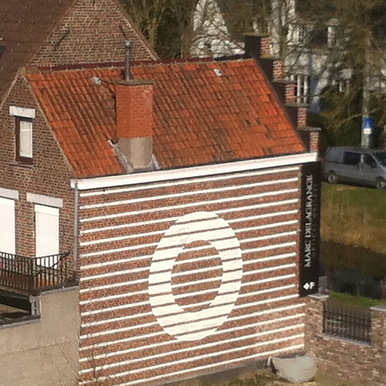
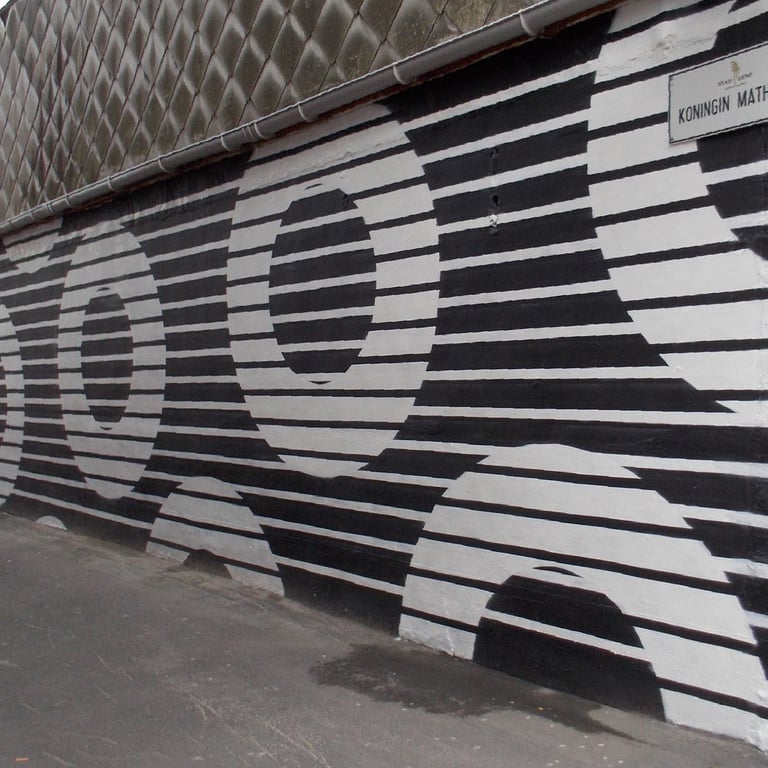
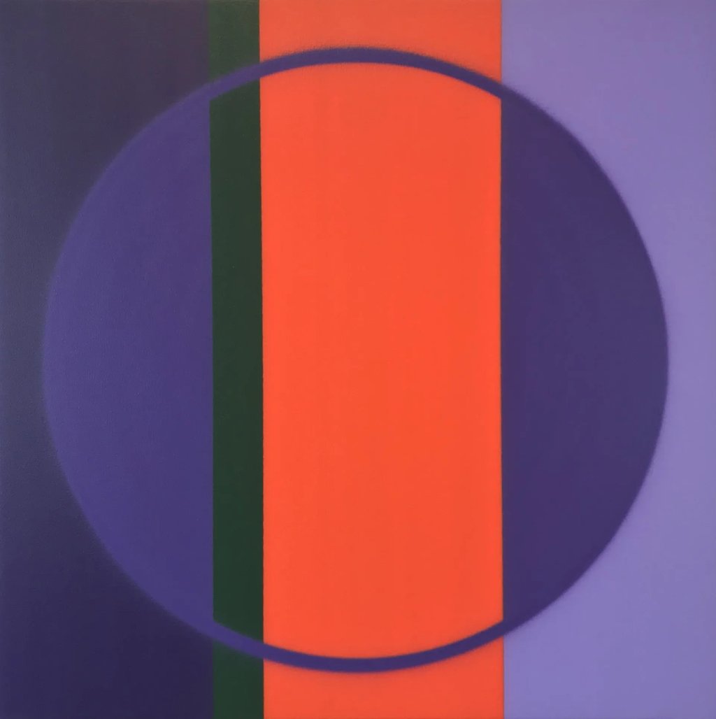
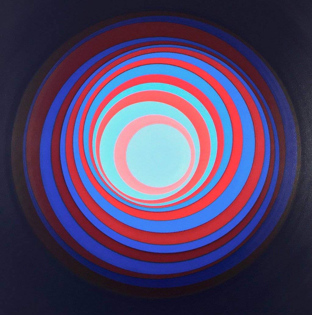
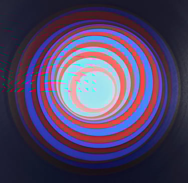
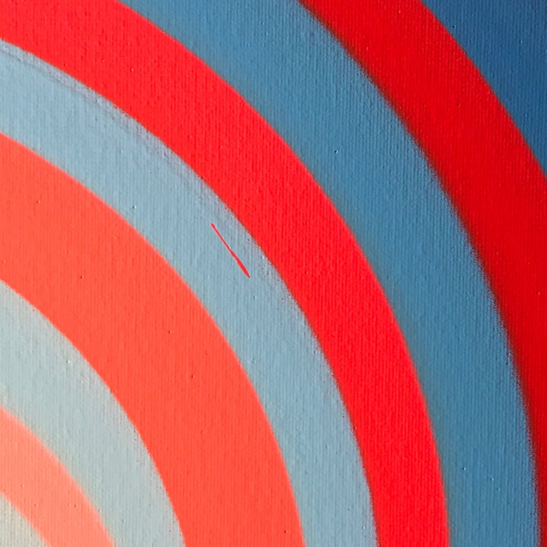
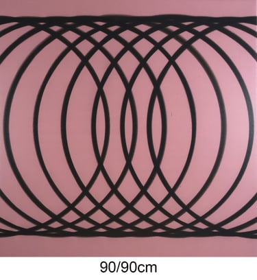
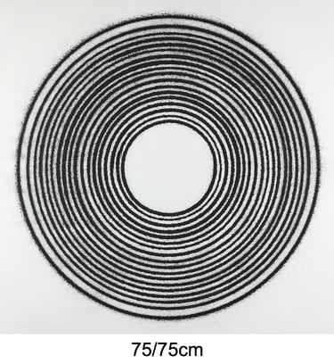
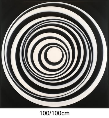
This design is definitely one of my favorite creations. Theoretically the lay out of the circle and the positioning of the lines are very precise and hard to paint to perfection with a spray can. I have made many versions in various color combinations and eventually started calling them 'Sliced Doughnuts'.
The motif has become my logo and I have used the concept on two occasions when I was asked to paint a mural.
120/160cm
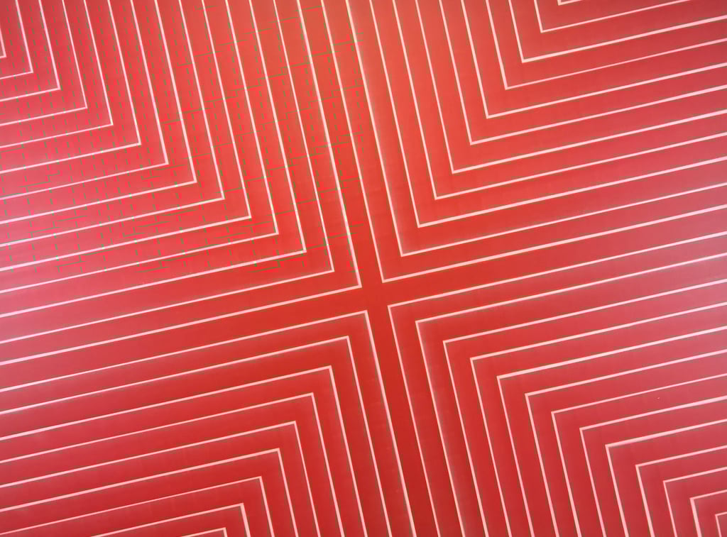
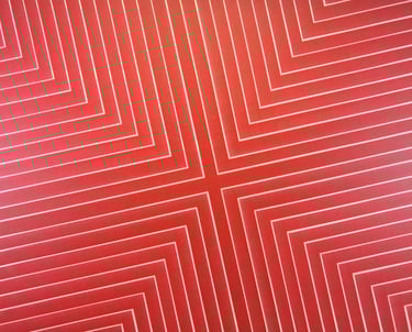
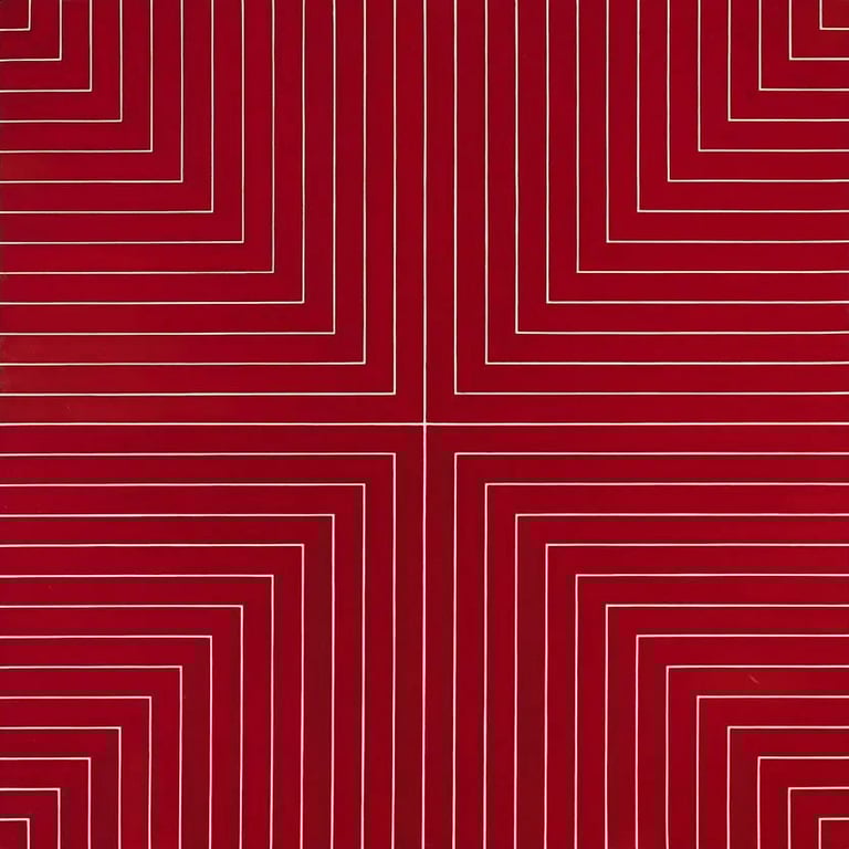
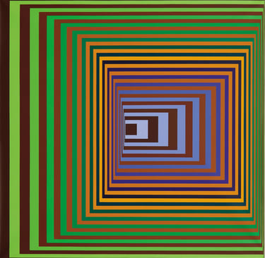
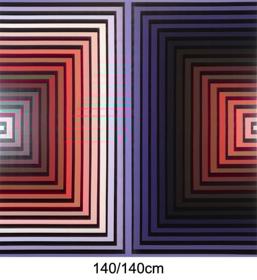
Inspired by Frank Stella's 'Delaware Crossing', painted in 1961 as one of the Benjamin Moore series and measuring 195/195cm.
The structure of this work is quite unique even by my own standards. While most paintings are painted from the center towards the edges, this particular one was executed the other way round.
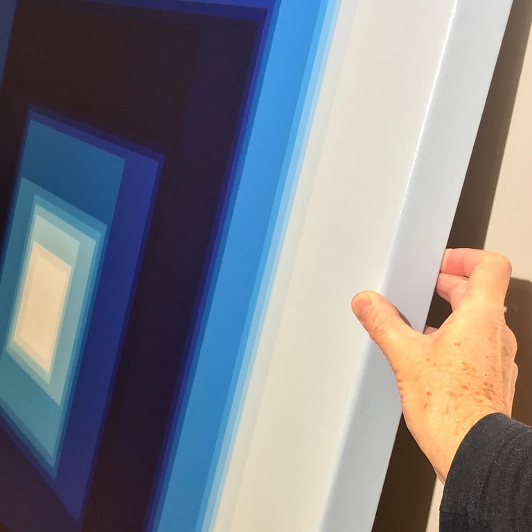
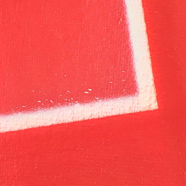
In reality the white lines are half a centimeter on average and the casual minuscule specks are further proof that there is absolutely no usage of masking tape.
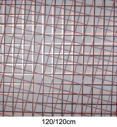
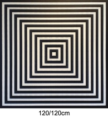
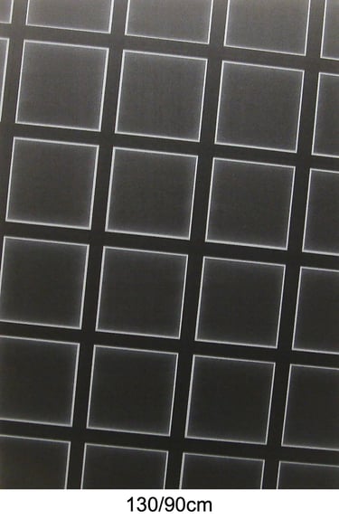
120/120cm
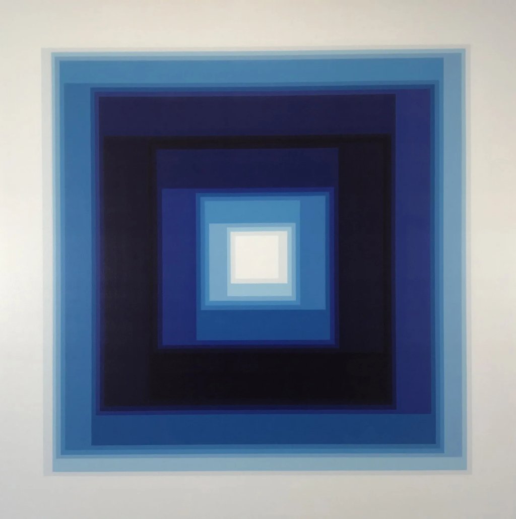
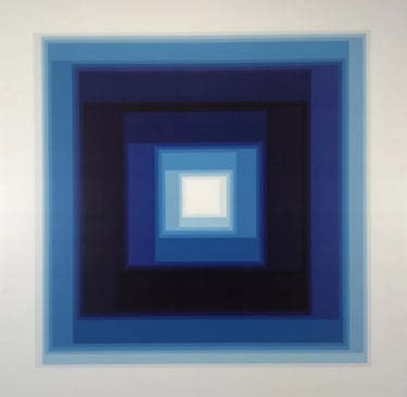
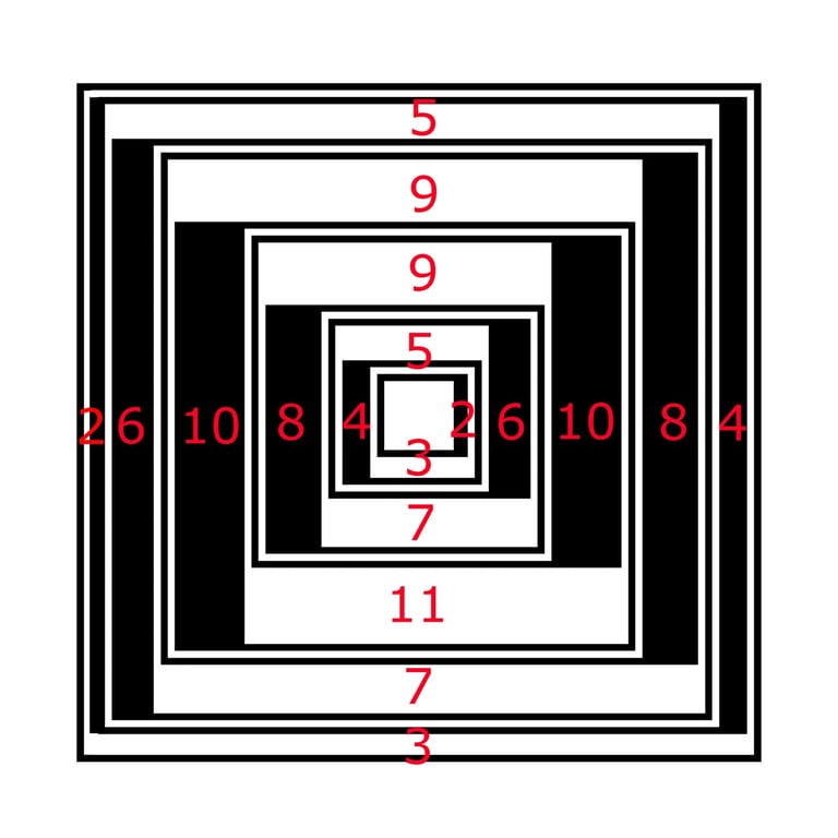
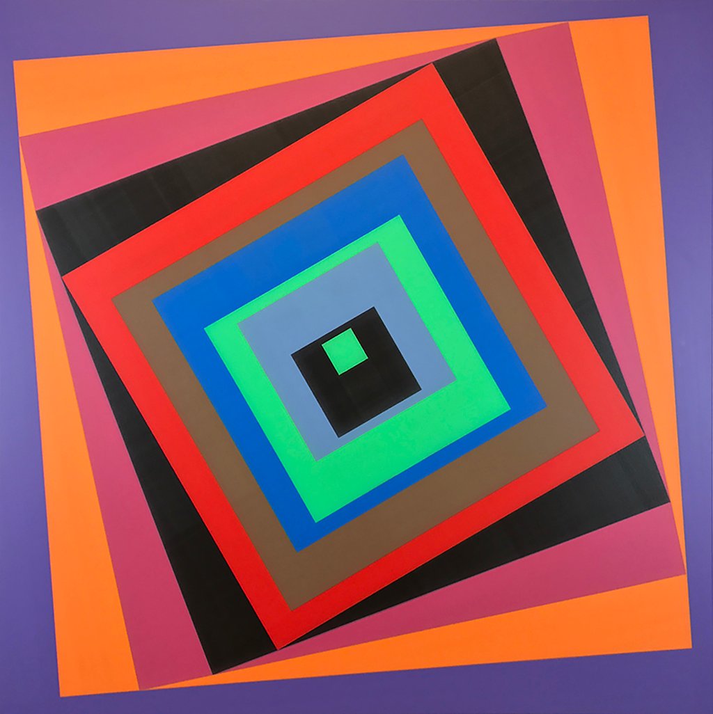
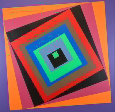
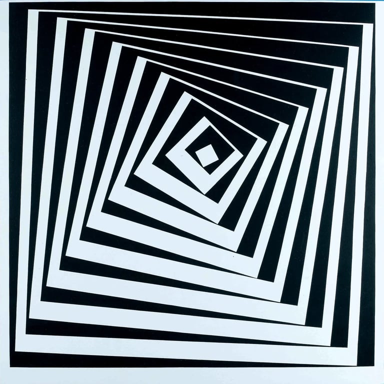
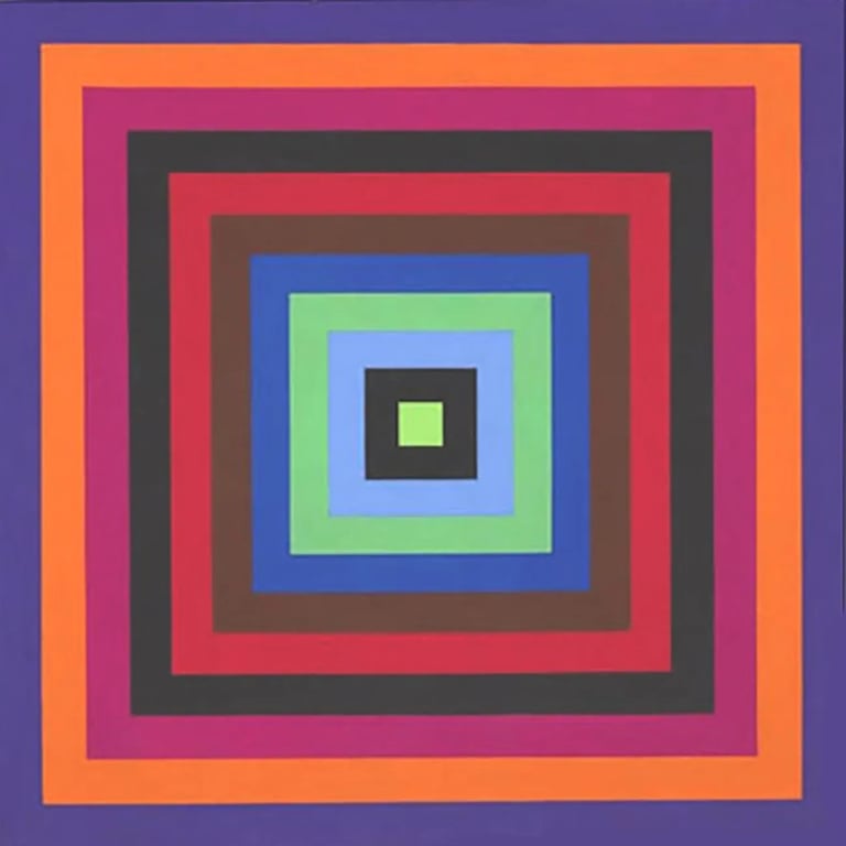
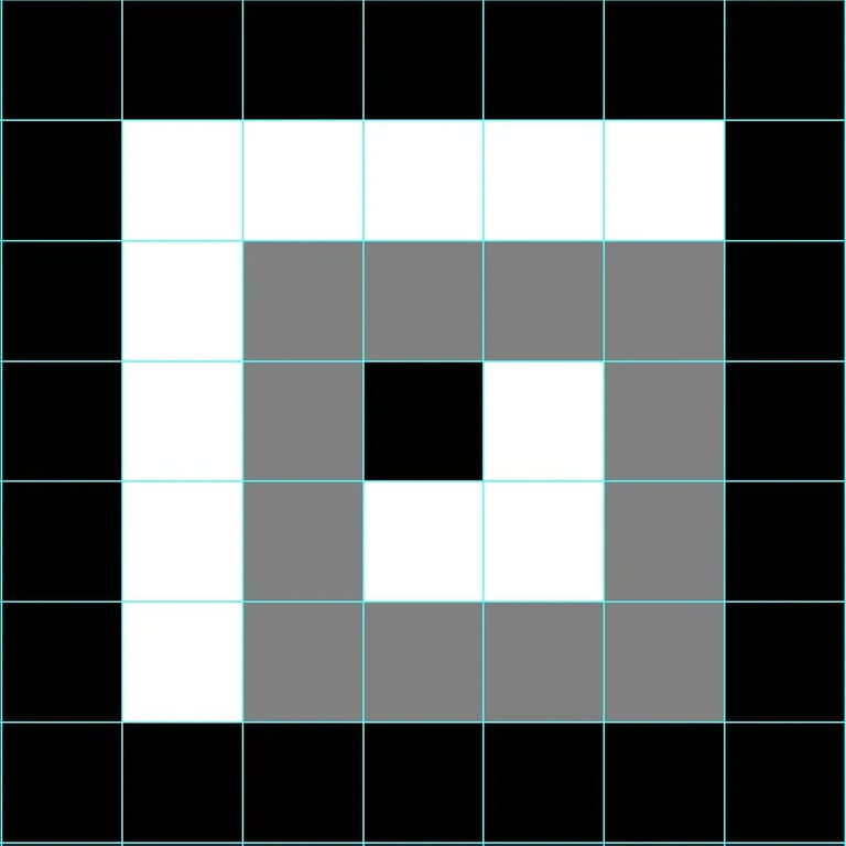
I spend a great deal of time making digital sketches on the computer. For this particular painting I started off by literally adding a twist to Josef Albers' Homage to the Square' design.
The black and white sketch demonstrates how the margin of each square first grows and then diminishes clockwise. Theorethically the narrow lines are one centimeter wide (because of the manual process, the actual widht can fluctuate somewhere between 8 and 11 millimeters) while the margins vary from two to eleven centimeters.
When I began experimenting with the coloring I noticed that gradually filling each space with a different hue of the same color, the design as a whole turned blurry. This way I unexpectedly created some kind of optical illusion.
120/120cm (Ø170cm)
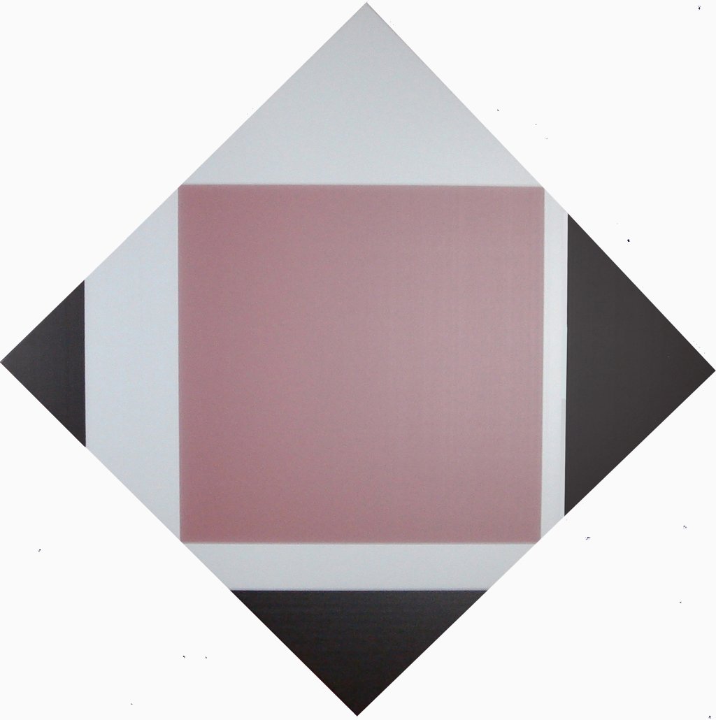
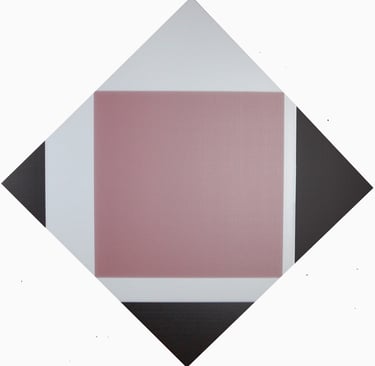
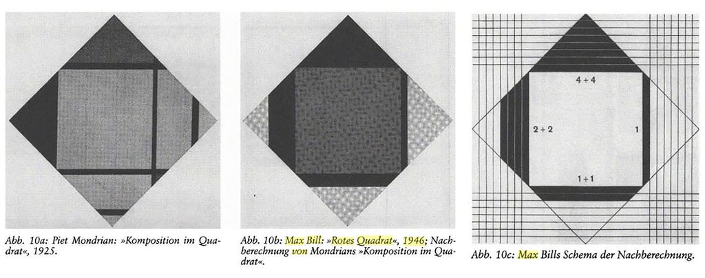
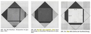
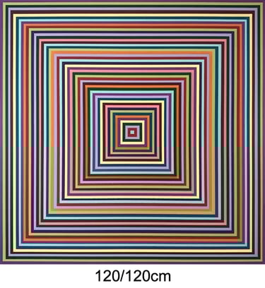
I don't remember exactly when or where I found an article about Max Bill examining a number of diamond shaped paintings by Piet Mondriaan and Theo van Doesburg but I do remeber that I saved the image below. I also remember being intrigued by the minimal simplicity of the concept and soon afterwards I decided to paint a spray can version of it.
The design is a textbook example of the use of mathematical relations which is characteristic in the oeuvre of Max Bill and the Art Concret movement in general.
160/160cm
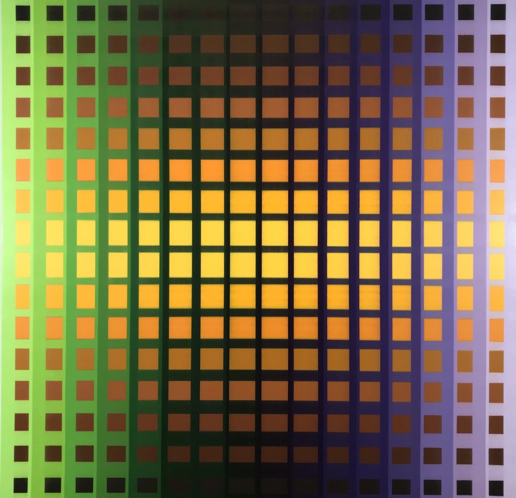
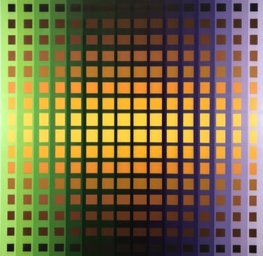
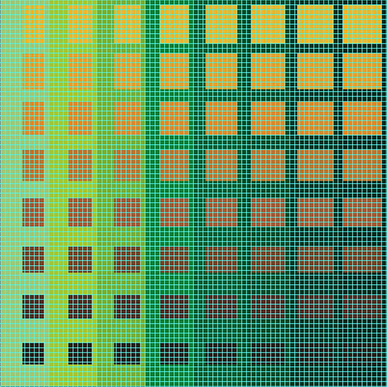
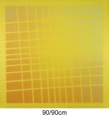
First of all I have to admit that I would never have come up with the combination of brown, yellow, green and purple if it wasn't for Victor Vasarely's 'Vonal Stri'
Being a great admirer of his oeuvre, I am often looking for sophisticated geometric constructions that will put my skills to the test, taking the restrictions of the applied technique into account.
In the pictures below you will notice that the painting of 160 by 160 centimeters is ultimately devided into 102.400 square half centimeters in order to design a pattern with shrinking rectangulars towards the edges.
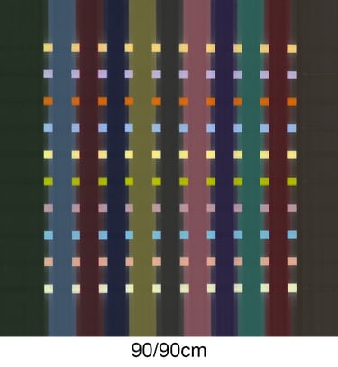
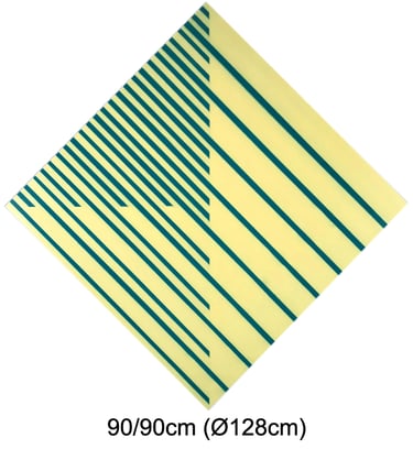
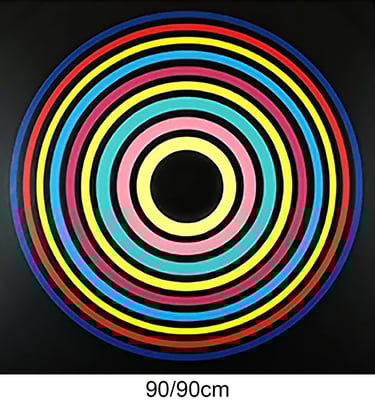
90/90cm
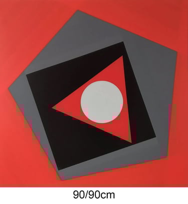
This painting was inspired by a typical composition of French artist Geneviève Claisse (1935 - 2018)
Besides slightly relocating the positions, trading green for blue and adding a perfect circle, perhaps the most thought-provoking feature of this painting appears when looking at it from aside.
This is a perfect illustration of how a few creative interventions can add a personal touch to a borrowed idea. Merci Geneviève!
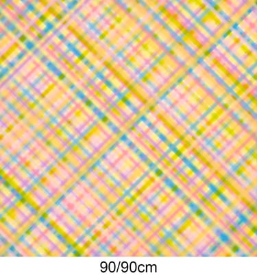
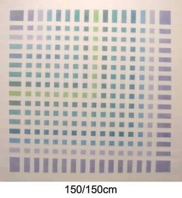
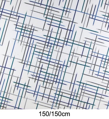
150/150cm
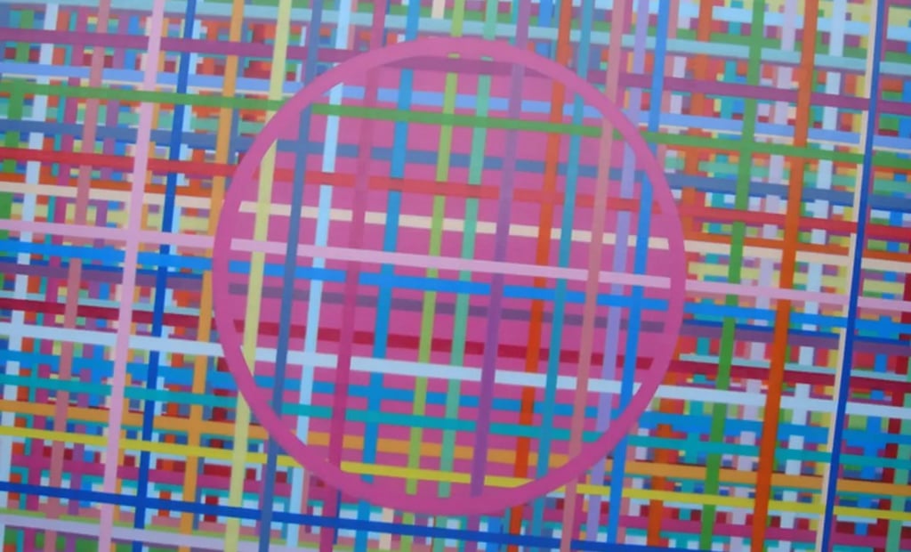
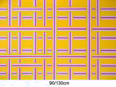
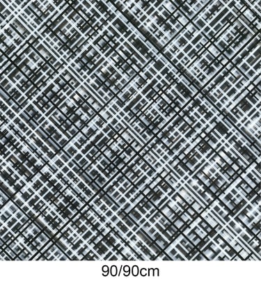
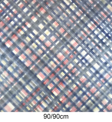
This painting is composed by a myriad of woven lines creating an illusion of depth. It is a simple yet attractive theme that I have executed several times using different color combinations or various widths of stripes.
In the last two pictures I have used paintings of 150/150cm which were cut up into 9 equal parts and then scrambled in order to assemble a vibrant installation.
90/90cm
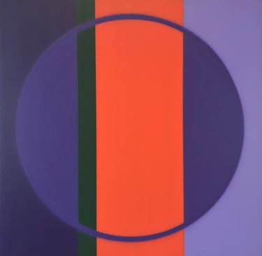
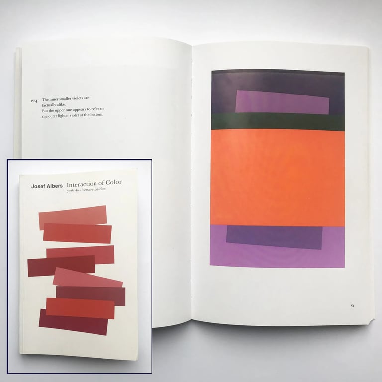
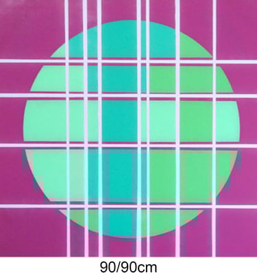
Inspired by an image in the 'Interaction of Color' book by Josef Albers, this painting is indeed an optical illusion.
After I managed to find the suitable spray cans matching the colors from the picture I transformed the design into a composition with a circle rather than a rectangle. The optical illusion is the perception that the purple parts to the left and the right in the circle appear to be two different hues. Putting this perception to the test I spray-painted the circumference of the circle to prove that it is undianably the same color.
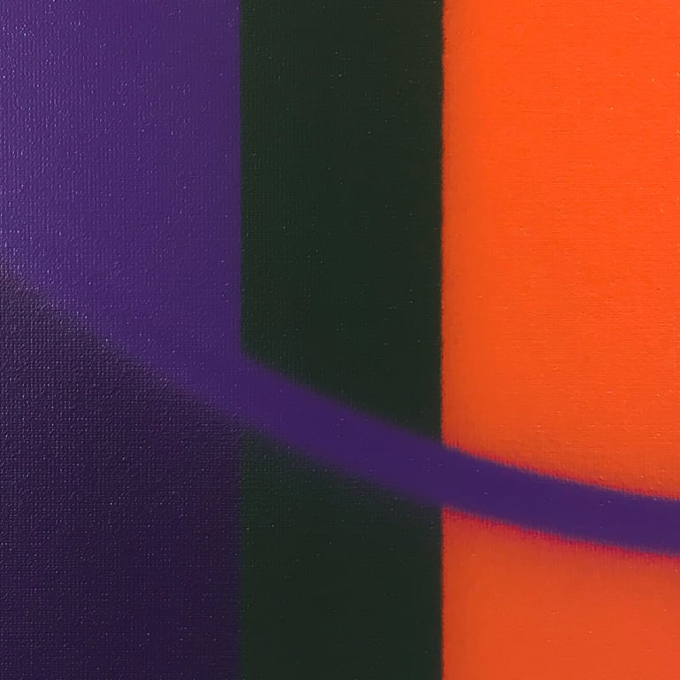
100/70 cm
A perfectly balanced configuration in combination with a slightly disturbed rhythm and executed with a needle cap rather than a regular one gives this relatively small painting a sense of gracious imperfection.
Even the sides of the painting share this pleasing discomfort.
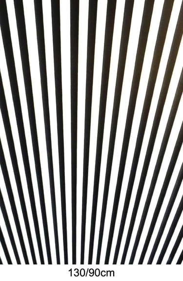
130/130cm
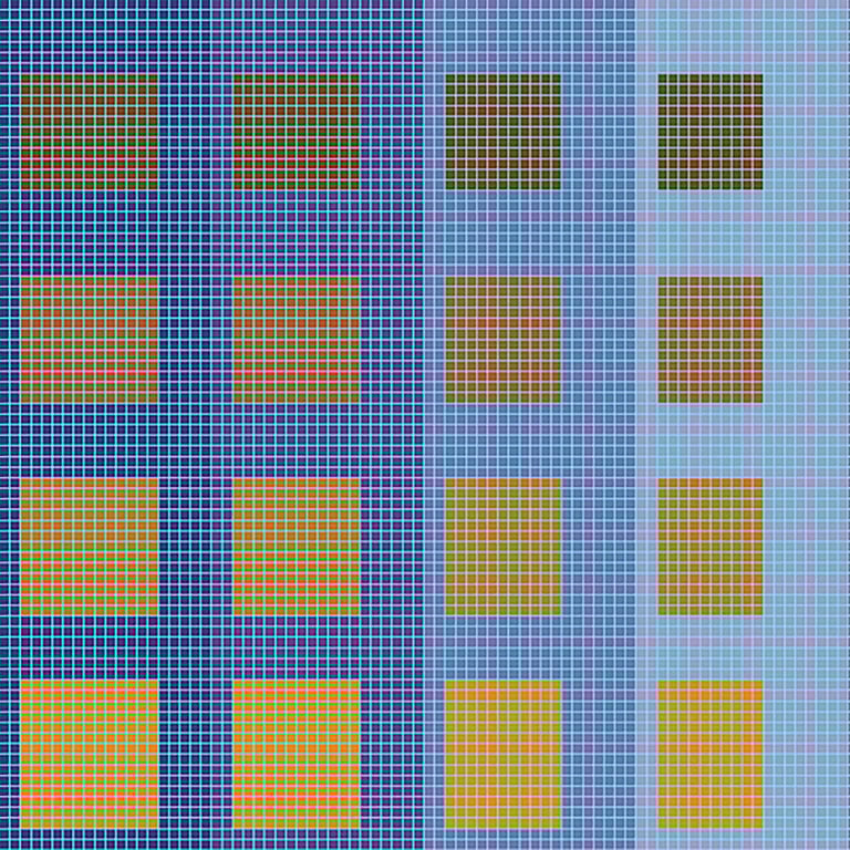
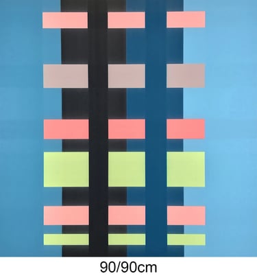
This painting is a fusion between two unrelated paintings, one by Victor Vasarely and another one by Gregorio Vardanega. The structure is partly based on the former, the choice of colors on the latter.
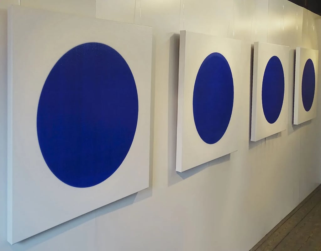
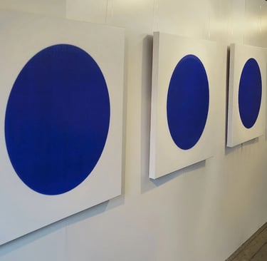
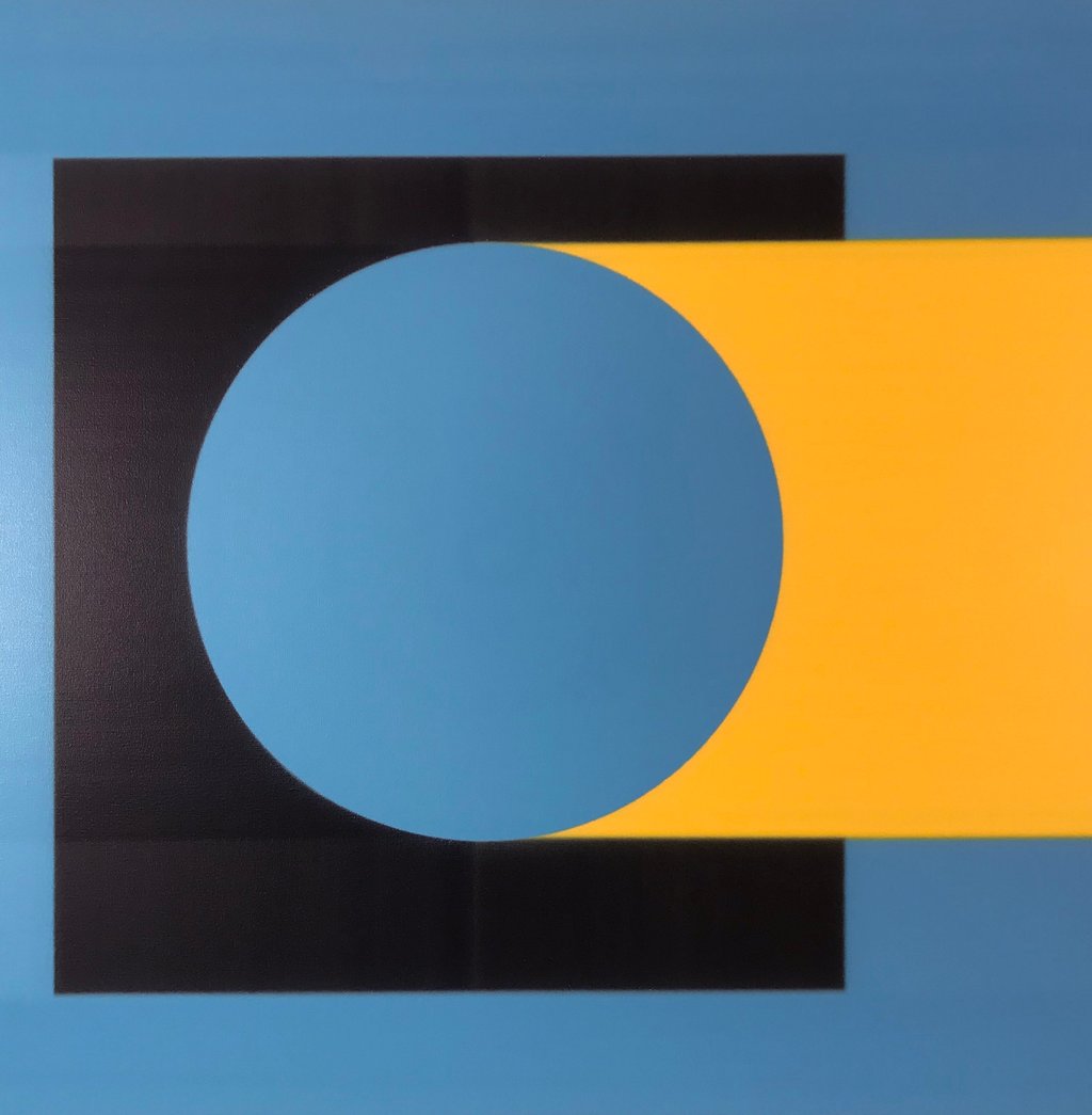
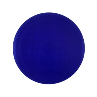
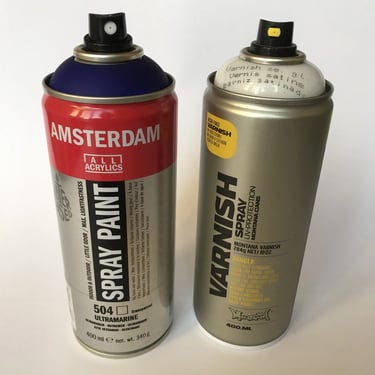
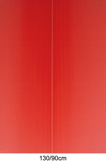
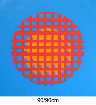
A series of four matching paintings. I have done a lot of testing and experimenting with different types of the 'Yves Klein Ultramarine' color and although I am a loyal user of the Montana brand, the best quality of spray paint for this unique blue color that I was able to find is the one by Amsterdam.
Because it is water based and fairly transparent I sprayed it on a glossy opal blue background giving it some kind of grid structure. To make the circle really stand out from the satin white contour I covered it with a layer of varnish. With the right lighting, this painting truly comes into its own.
90/90cm
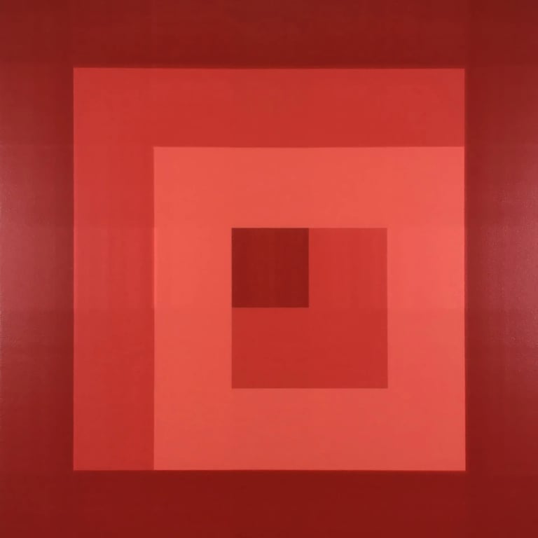
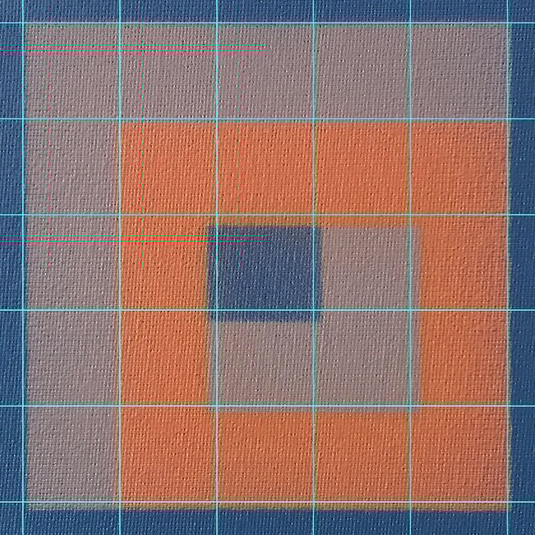
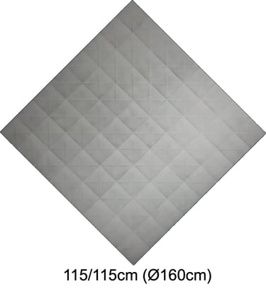
Compared to Josef Albers’ ‘Homage to the Square’ design, where he positioned the squares within squares in a geometrical declining (or increasing, subject to interpretation) order, I have experimented with a few interesting square related compositions of my own. This painting is executed in three different shades of red, while the black and white presentation below shows the mathematical proportions of the design.
90/90cm
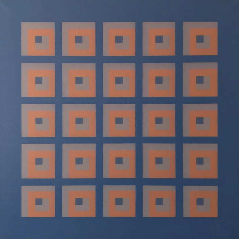
The painting to the right consists of 25 almost equal compositions of the same type as the painting to the left. The helping lines on the close up below reveal the degree of accuracy obtained in spite of using spray cans to cover lines of approximately 2,5 centimeters. There are a total of 62 lines involved and although at first sight all of the 25 squares look identical, they are all diverse.
119/114cm
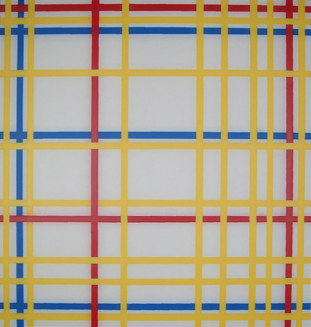
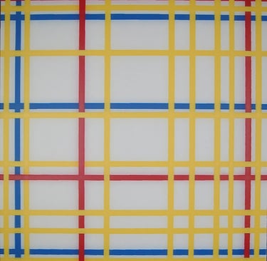
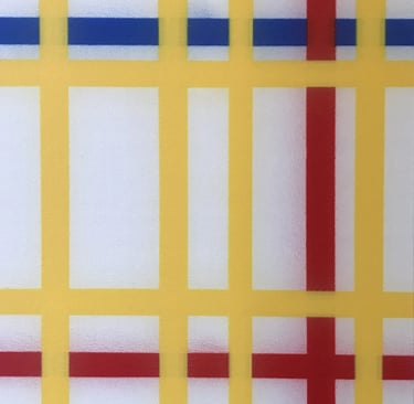
This spray can version of Mondriaan’s ‘New York City’ comes close to the original version.
The measurements are exactly the same and the colors match perfectly. Despite the limited possibilities inherent to the technique, there are only two points of crossing lines where the colors are inverted. This was possible by accurately calculating the sequence in which the lines had to be sprayed.
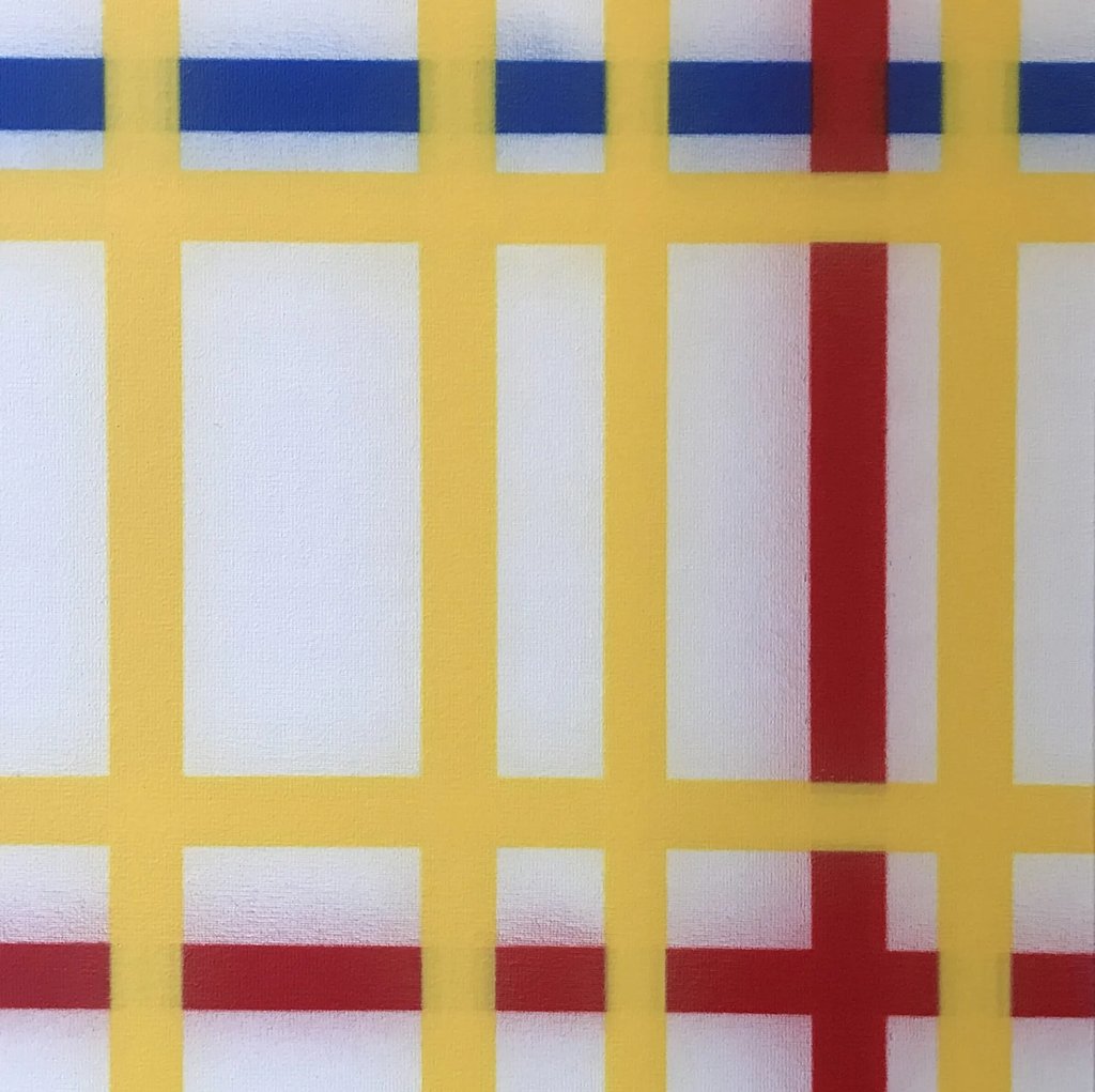
A keen eye for detail also detects that, corresponding to the original version, the second yellow line from the right is clearly narrower than the other ones. A close up of the right middle section shows the width of that particular line as well as the haze aside the blue and red ones.
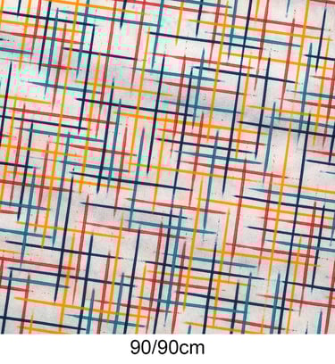
90/90cm
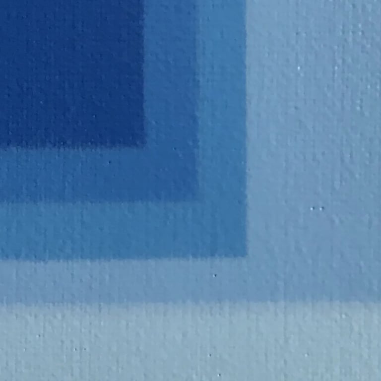
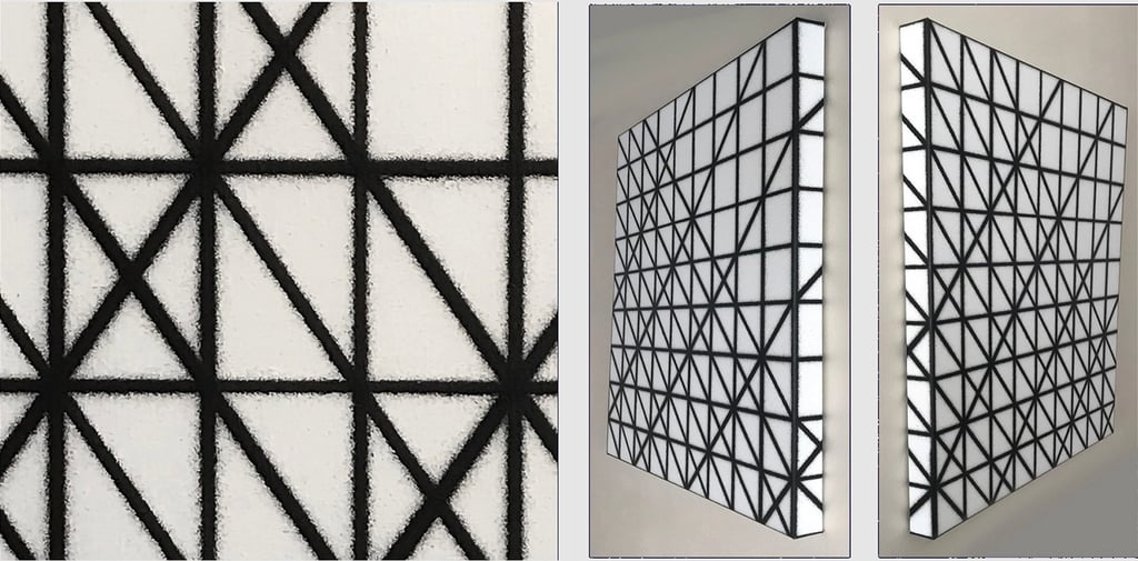
The details in this painting show that spray caps usually generate tiny specks and even leave large splatters occasionally.
Sometimes when it occurs along the process it might ruin a painting to such an extent that I have to start all over again or even throw the entire canvas away. On the other hand every now and then I will consciously leave it as it is, especially when it enhances the unconventional painting technique.
160/160cm
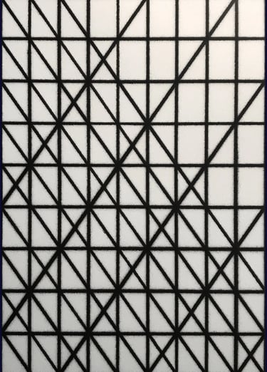
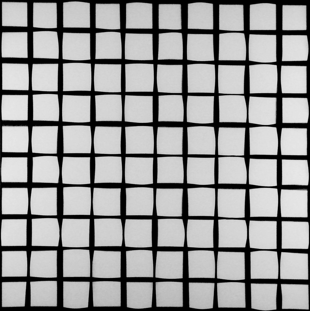
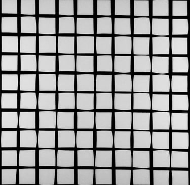
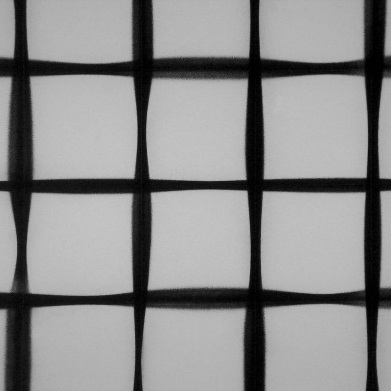
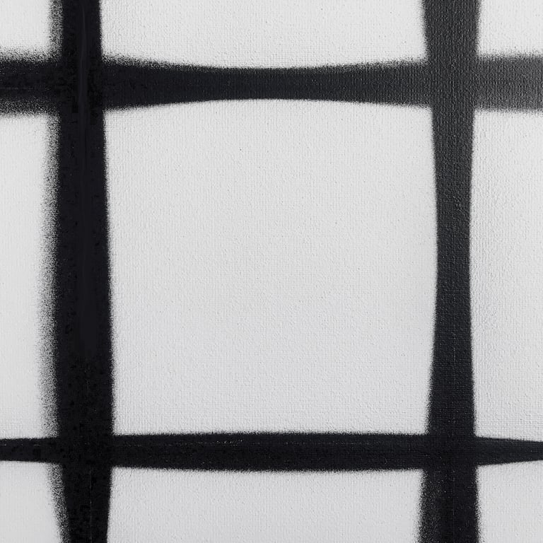
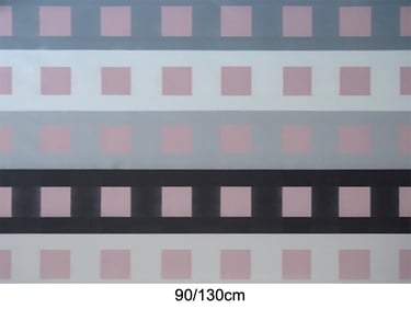
Obviously, the first thing to notice about this painting is the fluctuation of the width of the black lines which leeds to the irregular forms of the white squares. Of all the paintings in this gallery this is most likely the ultimate proof that I do not use masking tape or rulers to spray straight lines.
Another feature of this work, especialy when observing it in reality, is that it has the same properties of the optical illusion in the Hermann Grid.
Click the first image of the gallery below to watch the full paintings in carousel mode